MIHIR LELE
AMAZON PRIME: ZAKIR KHAN'S TATHASTU
Logotype Design | Poster Design | Motion Graphics
Client
Amazon Prime Video
Agency
OML Entertainment Pvt. Ltd.
Stand-up Comedian
Zakir Khan
Design and Animation
Mihir Lele
Brief
Zakir Khan' s "Tathastu" (meaning "So Be It") is his third comedy special with Amazon Prime, and his most personal yet. The special chronicles Khan's story from a humble home in Indore (Madhya Pradesh, India) to sold-out shows across the globe- sprinkled with bittersweet events and memories from his years growing up and more importantly, his grandfathers influence in his life.
I was approached to design the key-art poster, logo and the packaging for the special.
The Key Art and Logotype
Since the show is an ode to Zakir's grandfather, rich with Zakir’s quintessential storytelling and anecdotes , we approached the visuals for it in the same way-aiming to design an evocative and classy key-art with the artist looking back at his life, roots and experiences. without taking the usual, run-off-the-mill "stand-up special" key-art route.
Using some stills from a post-show photoshoot and some stills from the show taping, we explored some routes for the key-art, each route with its complimenting typeface:

(Above) This route is inspired by the Indo-Arabic motifs seen in the special, from Zakir’s chikankari kurta to the overall vibe of the set.

(Above) Double exposure poster optons with the use of images that suggest a performance foreground image, holding a mic) that is rooted in deep thoughts and memories (background silhoutte, lost in thought).


Another Double exposure treatment. The images used here compliment the thought of Zakir performing his special to an audience in his most heartfelt, earnest way.
Logo Wordmark
We presented 7 font options in the above routes, which we thought best encapsulated
the nature of the show and complimented the layouts well, all while maintaining distinct readability. Since the posters are visually heavy, we relied on the personality and uniqueness of the font to compliment the overall design, without trying too hard to force fit a thought there.
The Hindi and urdu anyway added a layer of retro nostalgia to it.

Finalised Poster Design
After some permutation- combination trials with fonts, pictures and poses from the above routes, we finalised the key-art below, as it embodied the show and the artist in the best possible manner.

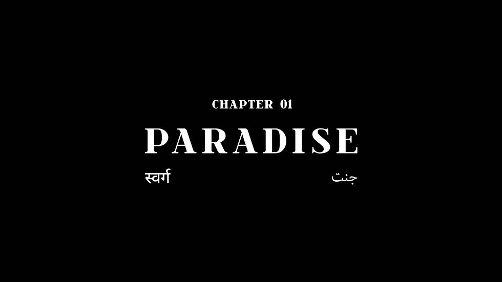
Title Packaging
A simple formation was suggested for the intro-slate in the show, that was used to book-end
the show, at the end of the show as well. Similar animation was adapted for the chapter slates
that appear in-between the show as well.


(Above) The official trailer of the show with the same title packaging at the end.
End Credits
For the end credits, a collection of photos and videos from Zakir's life were personally sourced and sequenced by him. We then added a few textures, borders and formatted them for the end credits of the show.
The one below is without the credit roll, and the one after that is with the credit roll.