MIHIR LELE
SUN CITY STUDIOS
Logo Design | Title Animation | Art Direction
Client
Sun City Studios
Identity Design and Animation
Mihir Lele
Brief
To design a logo for “Sun City Studios”- a film production company. The main usage of this logo will be on set and shoot locations, that will carry different signages, which will be an extension of the logo and the brand. The brief is to use a unique color palette that stands out in any space and a design that conveys the thought behind the name of the company.
"Sun City Studios” represents the ability of the production house to achieve everything under the sun and also be a source of energy, to make things happen.
The following are various explorations for the logo unit, presented under broad concept routes.The idea is to see what visual works best for the company from amongst all the routes presented.
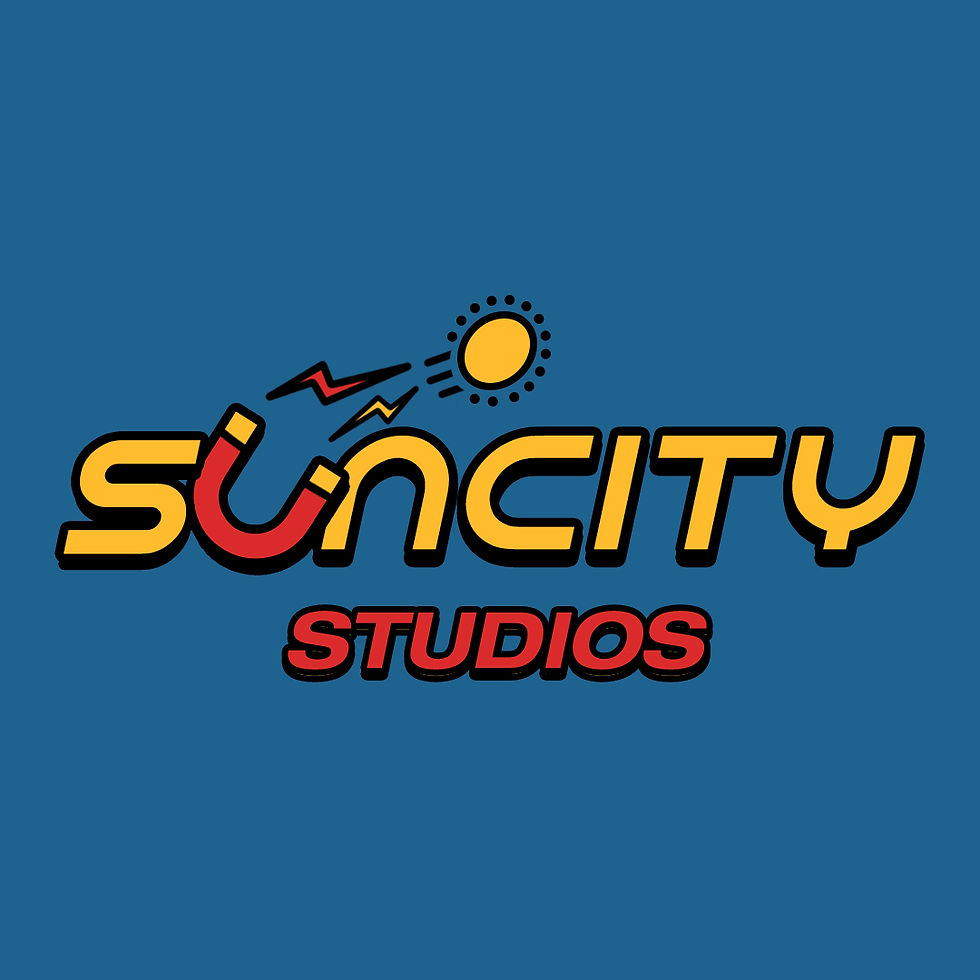
Logo Explorations- Route 01
Conveying a thought/ concept by highlighting an alphabet in the name
(Click on the image below to see the deck in full screen mode)


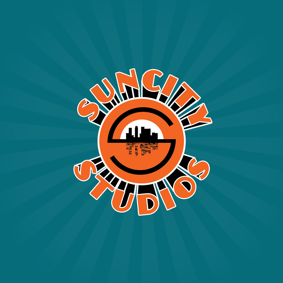
Route 02
An icon design, using the initials of the company- “S”


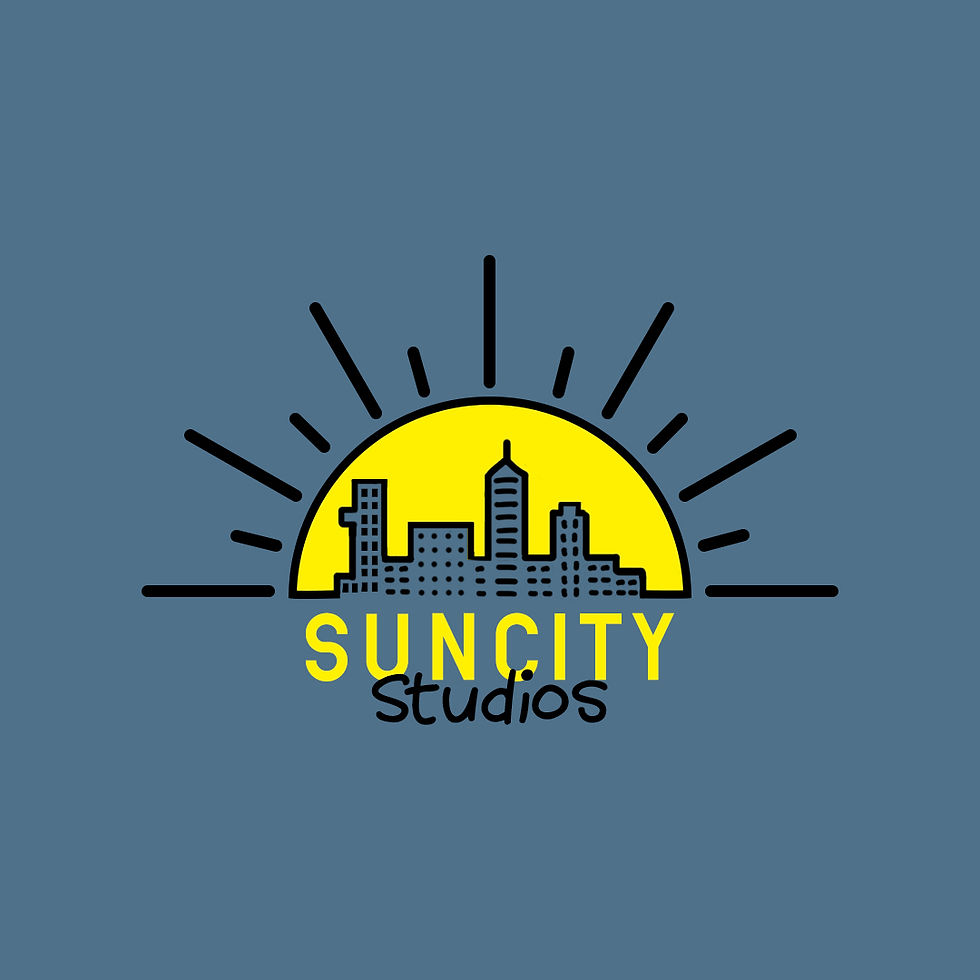
Route 03
Creating a logo using the two words that form the name of the company- Sun and City



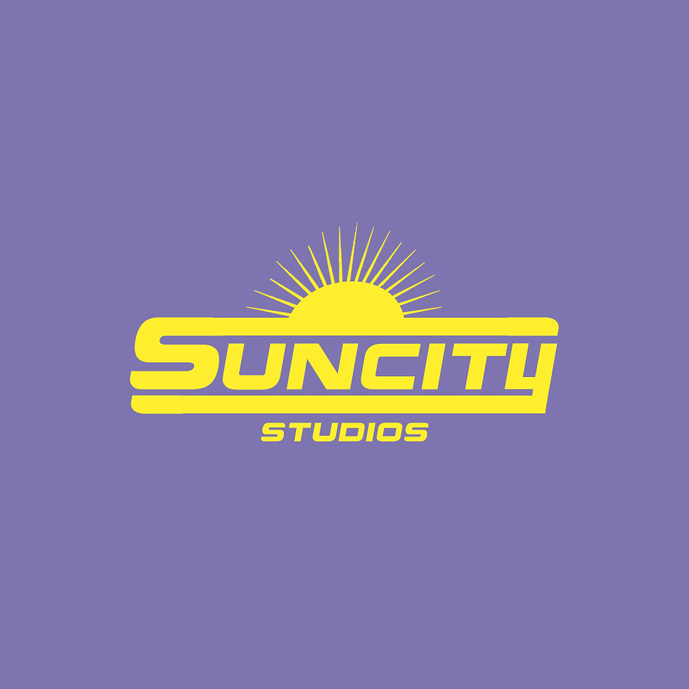
Route 04
Typographic Explorations

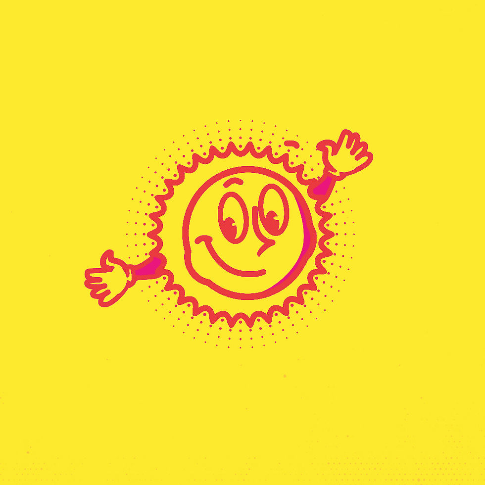

Overview

Finalised Logo Route
Sets are often high stress, high energy environments with a lot of things happening all at once with multiple people working like clockwork to achieve a common goal. The client wanted the branding to create a calming and/or fun environment by way of it's color palette and overall aesthetic, so the people on set are a little bit less stressed, looking at the signages and their branding.
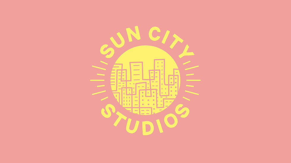
For this reason, the logo from Route 3 above was shortlisted and worked upon further to arrive at the final logo design below.

The client liked the simplicity in thought along with the color palette that presented ample scope for extensions and branding collaterals.
A few pages from the brand guidelines designed for the brand:
(Click on the image below to see the deck in full screen mode)


Illustrations
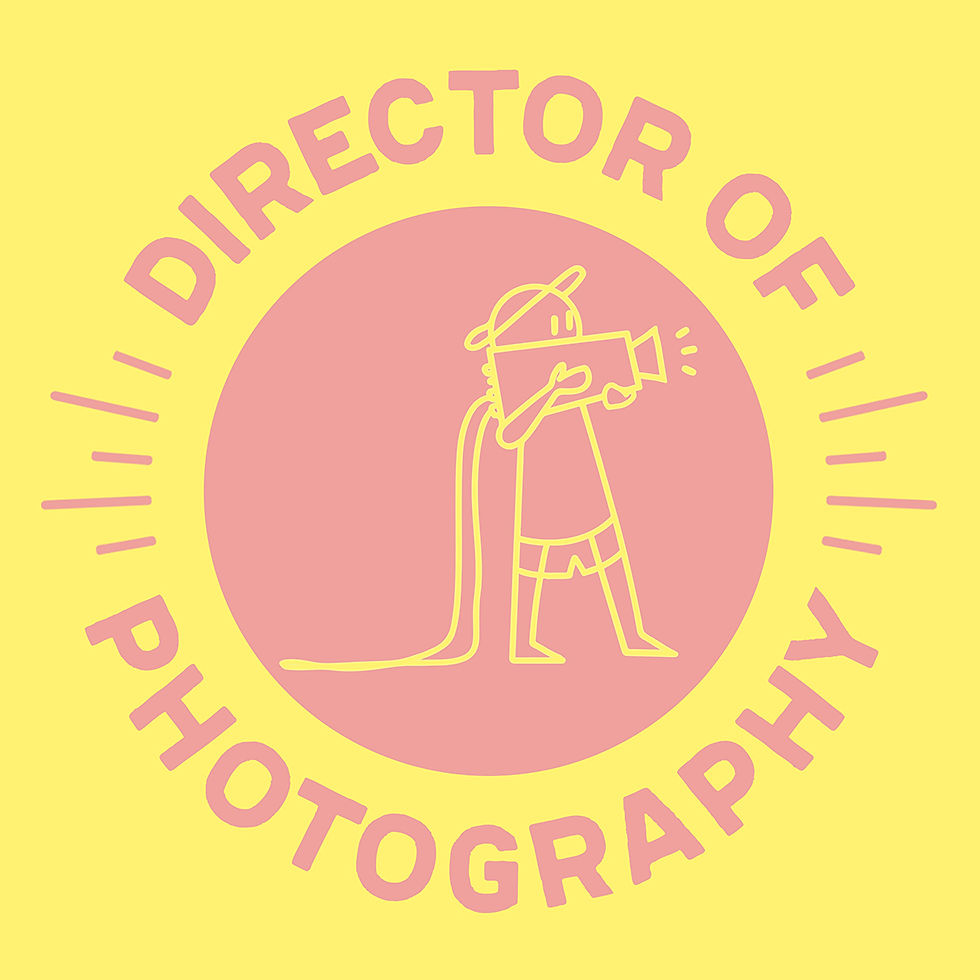
Some illustrations were designed for the set signages and/or decks, social media, etc.
Not only do these illustrations help extend the branding across sets but also help create a light environment on set by way of their design and humorous undertones.



Title Animation
An animation created to be used as an opening sting for their brand films.
The client requested for a quick and non-intrusive animation that they could place at the end/ beginning of their videos, to brand the films under the production house.
We had created another animation (below) - a more 'animated' version, if you will, but the client preferred the faster one above.
