MIHIR LELE
THE RIGHT PERSON TO ANSWER
Identity Design | Art Direction
Client
Deepak Gopalakrishnan
Identity Design and Animation
Mihir Lele
Brief
The Right Person To Answer is an audio-only podcast built around the idea that every individual has a unique perspective shaped by their experiences, skills, and journey. Each 20–30 minute episode explores a specific question or topic with the person best equipped to offer a meaningful perspective on it.
The visual identity should celebrate individuality, diversity, and the richness of human experiences, while maintaining a warm, curious, and uplifting tone.
Design Direction
The identity should communicate the idea of the “right person” without suggesting that one individual is being selected or picked over others. Clichéd visual tropes, such as a single red chess piece among a sea of white ones, are therefore avoided. Instead, the focus is on celebrating the different intersections of knowledge, experience, and perspective that make each person uniquely suited to answer a particular question.
Similarly, generic visual cues associated with answering questions, such as speech bubbles, microphones, or question marks, are intentionally avoided to create a more distinctive and ownable visual language.
Identity Exploration
The following routes explore an inclusive and universal visual language that represents the idea of every individual being uniquely suited to answer a particular question.
Rather than singling someone out, the visual system celebrates individuality while allowing the idea of the “right person” to emerge through the overall composition.


Design exploration- 02
Incorporating unique elements into the identity that resonate seamlessly with the essence of the interview series.
(Click on the image below to go into full screen mode)

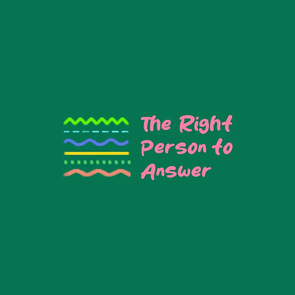
Design exploration- 03
Exploring typography alongside UI elements like scrolling or social media interface can effectively establish the visual identity of the series, ensuring clear and direct communication regarding the nature of the show, to the brand's target audience.
(Click on the image below to go into full screen mode)


Finalised Logo Route
The last logo, incorporating the person icon, was shortlisted for its simplicity and strong alignment with the brief. The icon also offered scope to introduce different “looks” and extend the visual language across the brand, while working well as a podcast thumbnail.
The colour palette was felt to need further refinement, so we explored a few alternative colour options, as shown below.


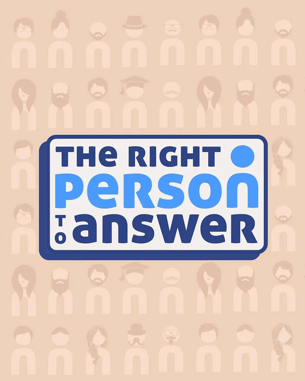
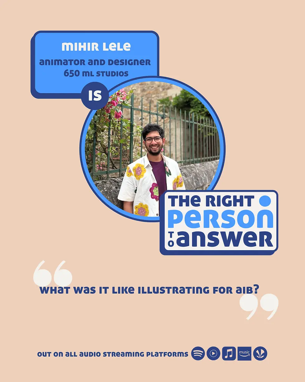
The 👤 icon in the logo offered a strong opportunity to extend the visual identity by creating different “looks” for people across creatives. This helped visually represent diversity and celebrate individuality, in line with the core brief.
We extended this idea further by customising the icon for each guest, making it visually resemble them wherever possible. This allows the identity to adapt across episode promotions, social media posts, conversation takeaways, quotes, and other guest-specific creatives.
The first colour option above was finalised as the visual direction for the podcast.
The next step was to extend the identity across other collaterals, creating a cohesive visual system that could be carried consistently across different creatives and brand assets.