MIHIR LELE
NETFLIX : ZAKIR KHAN'S PAPA YAAR
Logotype Design | Poster Design | Motion Graphics
Client
Netflix India
Agency
OML Entertainment Pvt. Ltd.
Stand-up Comedian
Zakir Khan
Design and Animation
Mihir Lele
Brief
Papa Yaar is Zakir Khan’s deeply emotional, autobiographical stand-up special—an affectionate tribute to fatherhood, middle-class upbringing, and the unspoken bond between a father and his son.
I was approached to design the key-art poster, logo and the packaging for the special.
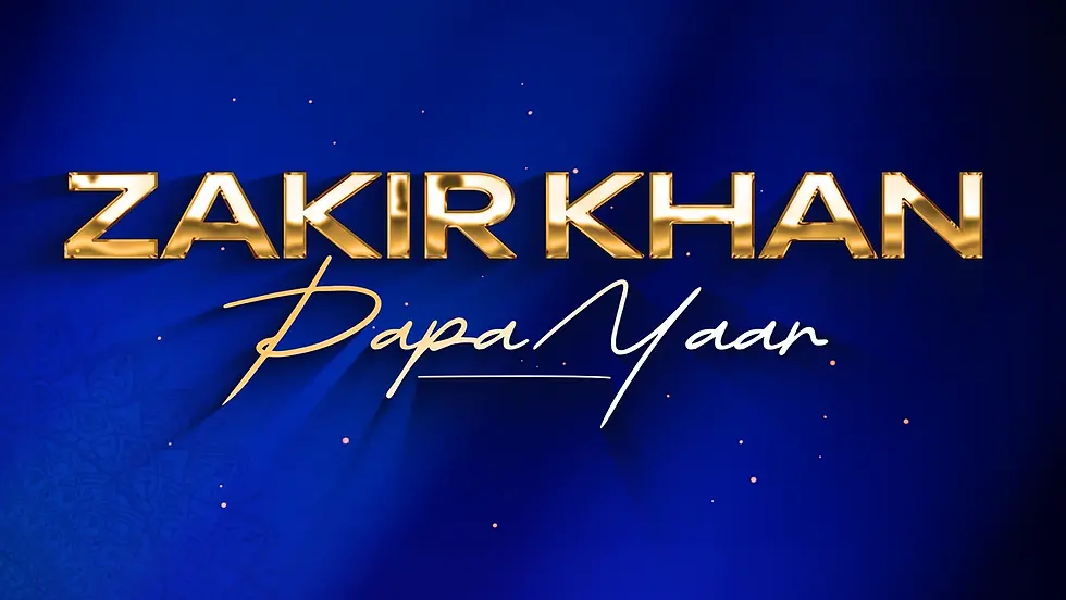
Poster and Title Design Explorations
The initial explorations covered a range of visual directions to identify the most effective language for the special.
For the poster, we experimented with different poses and expressions, title treatments, layouts and compositions, visual aesthetics, colour palettes, and textures. Across these explorations, the focus remained on Zakir as the visual anchor, while trying to find a design language that could balance the emotional and comedic nature of the special.


Alongside the poster designs, we also explored different approaches to the show's packaging, looking at how the visual language could work across different formats and scales.



Exploring a Retro Direction
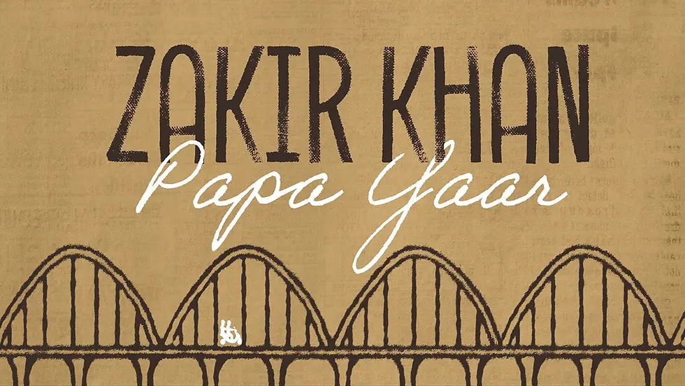
After multiple rounds of discussion and iterations on the posters and title designs, the team wanted to explore whether a retro visual language could work for the packaging.
A large part of the special draws from Zakir’s childhood memories—growing up around his friends, his father, and his childhood home. A retro treatment felt like a natural way to bring some of this nostalgia into the visual identity.
We therefore explored a few directions that leaned into this retro aesthetic.
Elements and visual cues from the narrative set were incorporated into the designs, helping build a visual language for the packaging that felt connected to the world of the special.

Finalisation
After further discussion, it was decided that while the retro direction worked well thematically, it did not quite reflect the scale and production value of the finished special.
The decision was therefore made to retain the retro-inspired title design, but place it against the more cinematic visuals of the actual show—particularly Zakir coming on stage. This allowed the nostalgic quality of the title to coexist with the scale of the production.
Meanwhile, the team selected an image of Zakir to serve as the key art for the special. The title was then integrated into this image to create the final poster.
For the packaging, the same title treatment was used more minimally, placed cleanly against footage from the show.

