MIHIR LELE
THE HOMI PODCAST
Logo Design | Title Animation | Motion Graphics
Client
IIT Bombay
Utsav Mamoria
Identity Design and Animation
Mihir Lele
Brief
The HOMI Podcast is a new YouTube interview series hosted by Utsav Mamoria, in collaboration with the History of Mathematics in India (HoMI) Project—an initiative by IIT Gandhinagar dedicated to researching and popularising India’s mathematical heritage.
The podcast aims to raise awareness among everyday Indians about the country’s rich and often overlooked contributions to mathematics—going beyond just Aryabhatta and the concept of zero. Through insightful conversations with scholars and enthusiasts, the show presents credible, accessible content, steering clear of political narratives or unverified claims.
The HOMI Podcast requires a visual identity and logo that reflect its core themes: Indian mathematics, intellectual curiosity, and clarity.
Design Brief (Do’s and Dont’s)
The design should subtly reflect India’s mathematical heritage without being ornate or minimal to the point of erasing character. The design should aim for a balance—historically rooted yet modern and approachable. It should be scholarly but inviting, with light hand-drawn touches evoking manuscripts or chalk on slate. The use of a clean, legible typefaces with subtle Indic influences is preferred; for quotes or verses, a calligraphic style inspired by traditional scripts may be used.
Identity Explorations- Route 01
This approach highlights mathematical formulas, symbols, or visual representations of equations to clearly communicate the podcast’s subject matter.
Since the logo is the audience's first point of contact, this route aims to make
the mathematical focus of the podcast instantly recognisable.


Route 02
This route focuses on celestial bodies studied in astronomy—like the sun,moon, and stars—to reflect how early Indian civilisations intertwined astronomy with mathematical understanding. The aim is to connect ancient scientific practices with the podcast's theme through symbolic and illustrative elements.


Route 03
This direction draws inspiration from historical Indian instruments that were used to explore and understand complex ideas in ancient India.


(This image illustrates the different instruments used to study astronomy in ancient India. The next logo uses some of those instruments in its design)

Route 04
This route infuses the logo with an Indian cultural essence, incorporating visual motifs and elements rooted in the geographic and historical origins of the mathematical concepts discussed in the podcast. It emphasises both the Indian heritage and the intellectual legacy of the subject matter.


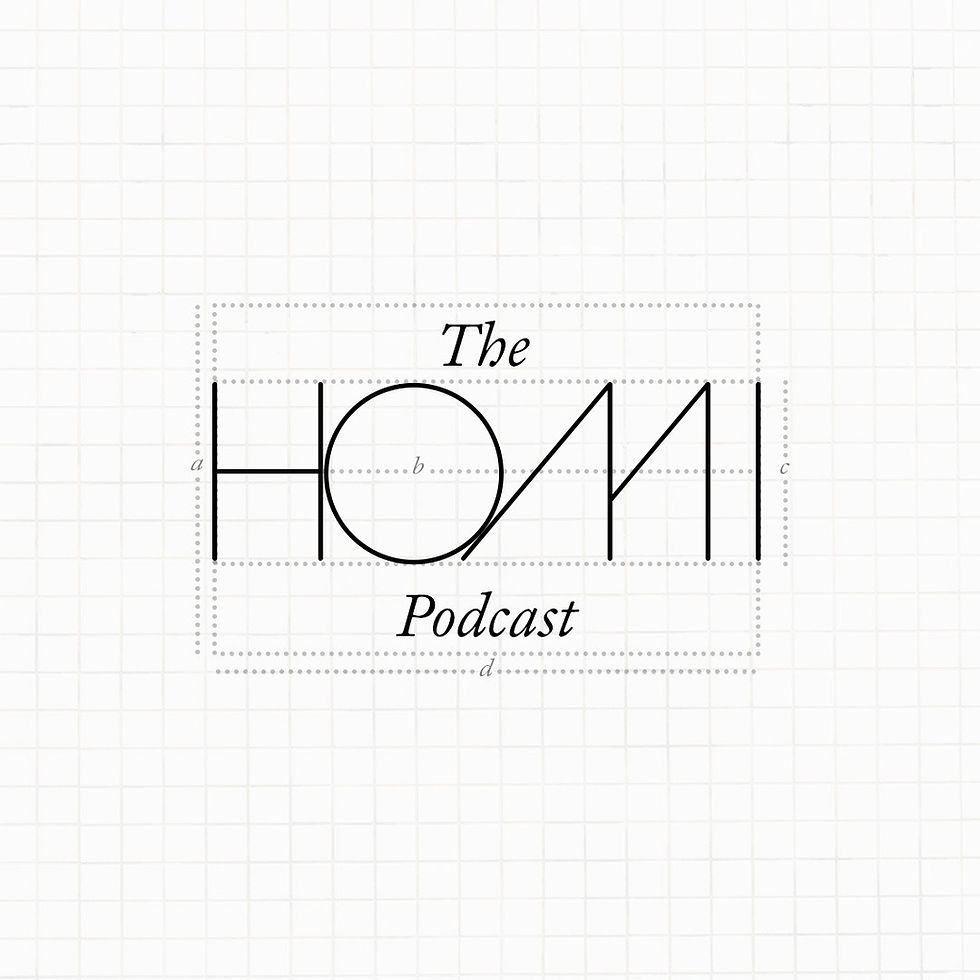
Finalised Logo Route
The logo from the third route, which incorporated references to historical Indian instruments, was shortlisted by the client for further refinement.
This direction stood out for its simplicity and its strong alignment with the theme of the History of Mathematics in India. The integration of a scientific concept—drawing from the relationship between the sun and its shadow, reminiscent of instruments like Jantar Mantar—adds both depth and cultural relevance to the identity.
It also offers the strongest potential for animation. The movement of the sun can be explored dynamically, with the shifting shadow responding to its position—subtly bringing mathematical principles to life in a clean and engaging manner.
The team felt that the earthy colours were dull, and felt that more energetic colours were needed. They didn't want the podcast to have a staid feel, especially since its normal to feel that for anything to do with 'ancient India'.
Basis the above feedback, the logo was refined, as presented below:
A clean hat-tip to ancient Indian instruments, presented in a contemporary, striking color palette and a wide typeface that invites attention and curiosity.
The next step was to animate the design in sync with the provided music track.
Title Animation
Music and Sound Design by Mehar Chumble