MIHIR LELE
AMAZON PRIME: SOMETHING FROM NOTHING
Logotype | Poster Design | Motion Graphics | Illustrations
Client
Amazon Prime Video
Agency
OML Entertainment Pvt. Ltd.
Stand Up Comedian(s)
The Improvisers- Kaneez Surka, Abish Mathew,
Kanan Gill and Kenny Sebastian
Design and Animation
Mihir Lele
Brief
'The Improvisers- Something from Nothing' is India's first improv comedy special.
Unlike most comedy specials, this one is completely unscripted, unrehearsed and based on live audience suggestions. The improv group comes up with ideas for sketches and scenes, on the spot.
I was in charge of designing the logo, show packaging, posters and end credits for the show.
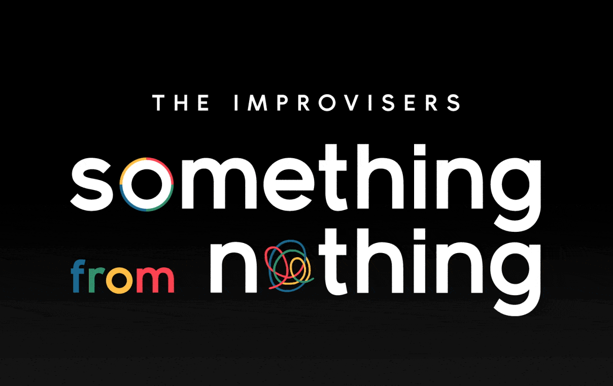
The Logotype
After going through different font options and designs for the logo, this particular design was chosen as it visually depicted the meaning of the words and embodied the nature of the show well.
The four color theme was chosen as each color stood for each of the four performers.
The squiggle coming together in the logo formation denotes the coming together of the 4 performers to make "something",where earlier there was "nothing".
Some versions of the logo that didn't make it to the final cut-


Show Packaging
During the course of an improv show, the troupe acts out scenes and sketches based on audience suggestions. While doing so, they put themselves in make believe situations and create worlds, environments and stories- not with any sets and props but just with imaginative actions and mimes-.
In adhering with this very core nature of the show, we developed an idea to take existing photographs of each performer and create a unique world around him/her with mix media elements.
For this, we even drew doodles, and arranged them into the worlds we created around the photographs. This gave the packaging a very organic, spontaneous and raw look- everything an 'improv' show stands for. The illustrated doodles were drawn spontaneously and made to look rough around the edges and slightly unfinished as it complimented the core idea of improv- to create something without prior planning or rehearsals.
The torn out collage-y doodle style was replicated even for the end credits of the show and it became a design language that tied the show together.
(Illustrations for the packaging by Kaneez Surka and Mihir Lele)
The Key Art
We decided to keep the key art very simple, using only key elements from the show. This included- a carefully picked out photograph of the 4 performers representing the rapport between them, the color theme, the idea of which was to to dedicate one color from the logotype to each of the performers and the elegant wooden flooring that serves as the backdrop for the entire show.

Transition Design
Since the show was divided into different segments of games and sketches, a transition was designed to enable the video to flow smoothly as well as tie the video together as one branded unit.
End Credits
The end credits of the show, feature the same torn out doodle style used in the packaging. The illustrations are a combination of elements and characters that denote a particular profession. Some crew credits are accompanied by their own personal caricature which added a personal touch to the show.
(Below) Some Illustrations of the crew members with their actual pictures for reference.


Watch the special on Amazon Prime Video.