MIHIR LELE
AMAZON PRIME : DIE TRYING
Logotype Design | Poster Design | Motion Graphics
Client
Amazon Prime Video
Agency
OML Entertainment Pvt. Ltd.
Web Series Creator
Kenny Sebastian
Brief
Kenny Sebastian's 'Die Trying' is a web series on Amazon Prime Video. Based in Banagalore 2004, the story follows Kenneth and Rohan, two small time musicians with big time dreams.
I was on board as the animator/ visual designer for the show. The scope of work included-
1. Logo Design for the web series
2. Art direction and design for the poster series of the show.
3. The look for the trailers
4. The online edit which inlcuded any specific graphics/ VFX for the episodes.
5. End credits for the show.
It was decided early on to incorporate illustrations and animation to give the show a fun, dynamic and easy going look. So the posters, trailers and end credits all had me working on fun custom illustrations and elements that were specific to the characters and their traits.
The Logotype
An exsiting font was taken and customised to fit the theme of the show. After going through different font options and designs for the logo, this particular one was chosen as it embodied the nature of the show well, it was easy to read on a tiny thumbnail (on the Amazon prime video library) and incorporated a subtle plug of the illustrations seen through the course of this series (packaging/ end credits/ etc.)

Logotype Options
Some other logo design options that didn't make it to the final cut.
Key Art
This included a show poster along with individual posters for the three protagonists of the show. While the show poster was designed to encapsulate the overall theme of the show and the hierarchy of its protagonists, the individual character posters were designed to subtly throw light on the character traits of the 3 protagonists.
All posters had elements from the show that are unique to each character and/or added some context to the story and the show in general.
Since these posters marked the first leg of promotions released before release of the show, I also art directed the photoshoot before designing them to make sure we got the right pose/ attitude for the first look of the web series that was unveiled for the audience.


Overview
Each character poster was designed with its own set of unique illustrations and color palette to shed light on the traits of that character. I decided to go with a coral pink for Kenneth's character poster, as he is the softer, lovable and chocolate
boy-ish of the lot. A blue for Rohan was chosen as he is the hyper male, angry protagonist, who is in direct contrast with Kenneth's character. And finally, a purple for Jason as he is somewhat in between the two characters by way of his nature as well his role in the show. So, a combination of pink and blue was chosen for his poster.
The main poster has illustrations borrowed from all three character posters, but with slightly less emphasis, as the character photos had to take lead in the main poster. The coral red for the main poster was chosen for its starkness, making it stand out amongst the sea of other title cards on Amazon Prime Video.


Trailers
The colors for all marketing collaterals associated with a particular character were kept the same. So it was a natural call to keep the text animation and the in-between slates for the character trailers in the same color theme as the posters as well. A VHS/ scratched CD effect was designed for the look of the trailers as it lent itself well to theme of the show.
The main trailer (below) also incorporates the running theme of illustrations specific to each character and binds the entire show in a homogenous package.
Character Trailers
End Credits
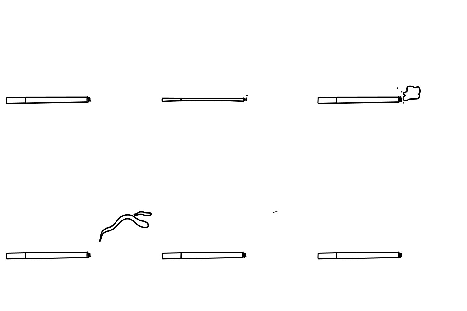
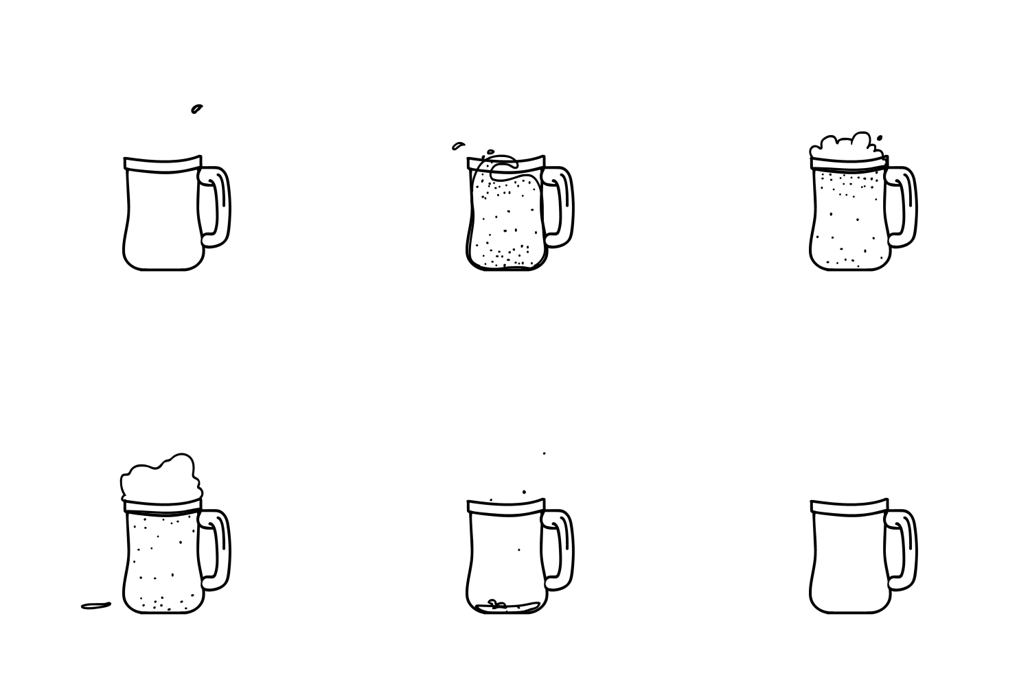
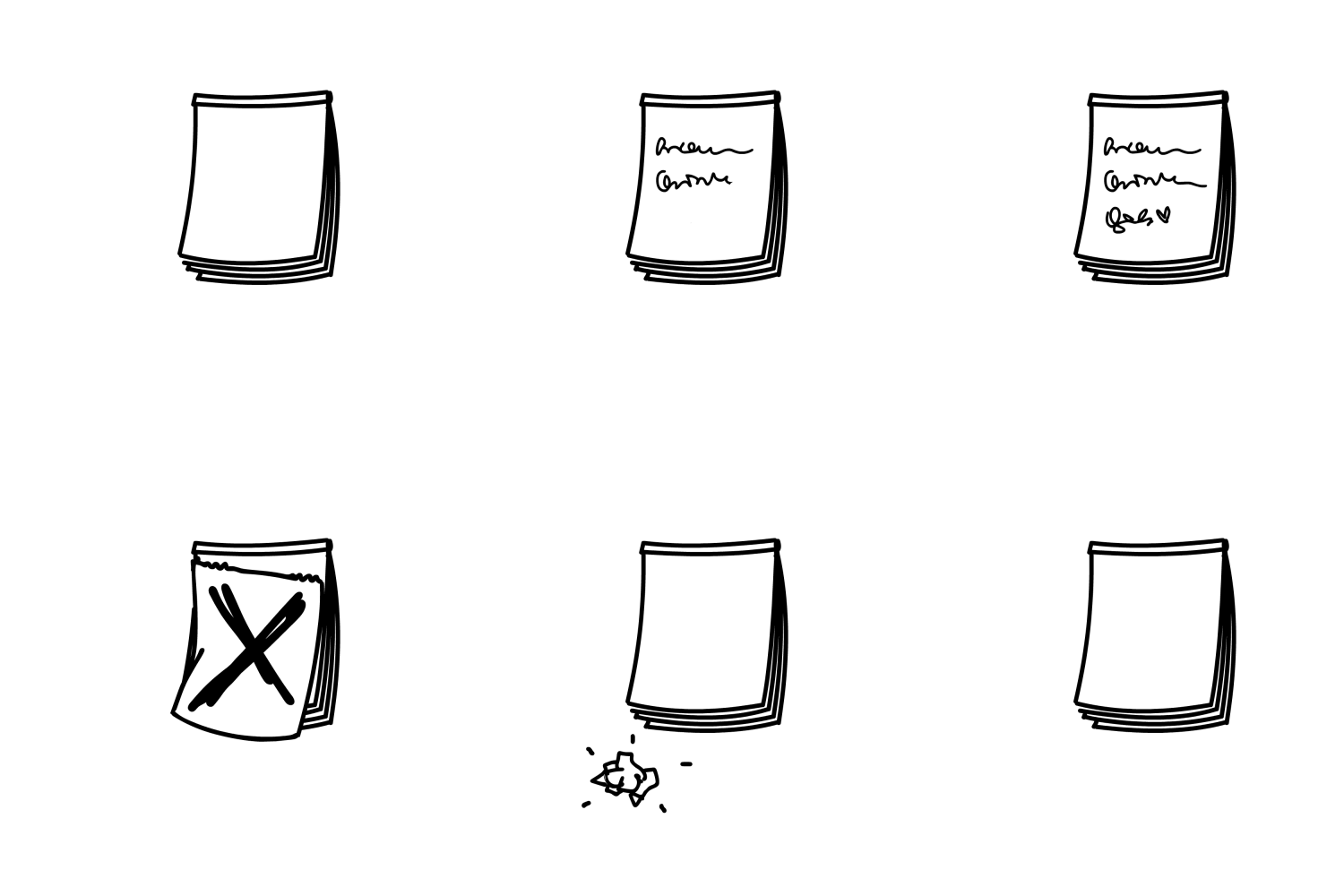
For the design of the end credits, I decided to illustrate and animate tiny elements unique to the show and its theme.
So once the audience was done watching the show, they would notice these elements in the end credits and it would serve as a call back to little subplots and elements they noticed in the show.
End Credits Layout
Finally, these animated loops were arranged around the end credit scroll.
Thus, we managed to achieve a singular theme running across all design collaterals for the show- the logo, posters, trailers and end credits.




Watch the web series on Amazon Prime Video.